Decorating with a single color palette is a simple yet powerful design strategy that can transform your home into a cohesive and calming retreat. By sticking to a unified color scheme, you eliminate the guesswork of matching decor, reduce visual clutter, and create a space that feels effortlessly polished. This approach isn’t just about aesthetic appeal; it also brings clarity and ease to the decorating process.
Whether you lean towards modern, traditional, or a blend of both, a single-color palette offers a versatile foundation that can be tailored to your unique style. From subtle neutrals to bold jewel tones, the possibilities are endless.
Benefits of a Single Color Palette
Choosing to decorate with a single color palette brings more than just visual appeal. It also offers practical benefits that make the decorating experience easier and more enjoyable.
Creating Cohesion and Harmony
One of the biggest benefits of decorating with a single color palette is the sense of harmony it brings to your home. A consistent palette ties each space together, making transitions feel seamless and avoiding the jarring effect of clashing hues. For example, using variations of warm beige or cool slate throughout your living room, hallway, and bedroom can unify your entire layout.
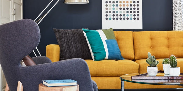
Apt2B’s sofas made in the USA come in a variety of customizable fabrics, making it easy to align your larger furniture pieces with your chosen color family.
Simplifying the Design Process
A single palette reduces decision fatigue. Instead of endlessly comparing colors and patterns, you can confidently select furniture, decor, and paint that fall within your chosen range. This approach not only speeds up your decorating process but also helps create a more curated, thoughtful environment.
Visual Appeal and Versatility
Monochromatic color schemes can be both elegant and expressive. Whether you're drawn to the sophistication of greyscale or the warmth of earth tones, sticking to one color family allows you to play with tone, saturation, and texture. You can maintain a sense of variety while keeping the overall look consistent and elevated.
Designing with Color Families
A color family refers to a group of related hues, such as various shades of blue or cream, that can be used interchangeably to build depth and interest.
Understanding Color Families
Using a single color family offers more flexibility than repeating one exact shade. For instance, a dusty rose wall can be complemented by blush-toned textiles and deeper mauve accents, creating a rich but cohesive space. This approach avoids monotony and helps your home feel layered and lived-in.
Implementing Color Families
Begin with an anchor piece, like artwork, fabric, or even a rug, that features your preferred palette. Use it to guide other decor choices, from wall paint to upholstery. Apt2B’s collection of area rugs offers plenty of stylish starting points that can inspire your overall color scheme.
Case Study: Studio McGee and Color Families
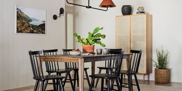
Studio McGee’s design philosophy embraces tonal palettes rooted in nature. Think soft whites, muted greens, and natural wood. By repeating similar hues across different materials, they create spaces that are cohesive, timeless, and highly livable.
Inspirations and Examples
Real-world applications can bring abstract design concepts to life. Here are a few designers and ideas to spark your creativity.
Jewel Tones for Dynamic Design
Jewel tones like emerald, sapphire, and amethyst add drama and depth to monochromatic designs. Try layering deep blue walls with navy velvet chairs, sapphire-toned art, and a matching accent side table to create a sophisticated, unified space.
French & French Interiors: Earth-Toned Elegance
French & French Interiors lean into rich, earthy palettes, burnt sienna, olive green, and terracotta, to evoke warmth and grounded elegance. Their use of natural materials and tone-on-tone styling is a masterclass in decorating with a single color range.
Adding Texture and Tonal Nuances
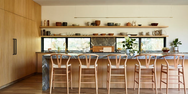
In a single-color room, texture becomes essential. Mix matte finishes with high-gloss surfaces, add tactile fabrics like boucle or leather, and bring in natural materials like linen, wood, or stone to break up uniformity and add richness.
Explore Apt2B’s leather chair collection for tactile statement pieces that bring warmth and depth into a cohesive color scheme.
Playing with Shades and Accents
Switching up the intensity of a single color keeps the space from feeling flat. For instance, a soft sage wall can be paired with olive drapery, forest-green accessories, and dark green furniture. These variations create contrast without disrupting the harmony.
Incorporating Different Materials
Mixing materials within the same palette brings dimension to your design. Wood, glass, metal, and textiles all reflect light differently, which keeps the room dynamic. This is particularly useful in open-concept homes where blending functionality and design is key.
Conclusion
Decorating with a single color palette is one of the most effective ways to create a home that feels polished, peaceful, and beautifully unified. From simplifying your design decisions to maximizing visual impact, this approach offers both aesthetic and practical advantages.
By exploring color families, adding texture, and taking inspiration from various designers, you can curate a space that feels thoughtful and timeless. Browse Apt2B’s curated collections of sofas, accent tables, and rugs to start building your own perfectly coordinated interior.
Let one color palette tell your story through every room in your home.